The Ultimate Guide to Neutral Color Palettes for Your Home
Neutral colors are the foundation of timeless interior design. Learn how to build sophisticated, layered color schemes using whites, beiges, grays, and earth tones that create warmth, depth, and enduring elegance in every room.
Understanding Neutral Color Families
Neutral does not mean boring. Each neutral color family has warm and cool variations that create vastly different moods. Understanding these undertones is the secret to a cohesive and inviting neutral home.
Warm Whites & Creams
Warm whites with yellow or pink undertones create an inviting, sun-kissed atmosphere. Colors like ivory, cream, linen white, and Swiss coffee work beautifully in north-facing rooms that lack natural warmth. Pair with honey wood tones and brass hardware.
Cool Grays
Gray tones with blue or green undertones evoke modern sophistication. From pale dove gray to rich charcoal, this family provides depth without heaviness. Cool grays pair naturally with silver metals, white marble, and contemporary furnishings.
Greige & Taupe
The hybrid of gray and beige, greige is the most versatile neutral available. It bridges warm and cool tones effortlessly, making it the perfect backdrop for virtually any decor style. Taupe adds slightly more brown warmth for earthier schemes.
Earth Tones
Terracotta, clay, sand, and mushroom tones bring nature indoors. These grounding colors create organic warmth and work particularly well in living rooms and bedrooms. They pair beautifully with natural materials like jute, rattan, and unglazed ceramics.
Sage & Olive
Muted greens have emerged as the new neutrals. Sage, olive, and eucalyptus tones provide a connection to nature while remaining soft enough to function as a background color. They complement both warm wood tones and cool stone surfaces.
Blush & Nude
Soft pinks and nude tones add warmth with a hint of romance. These barely-there colors work as accent neutrals alongside whites and grays. They are especially effective in bedrooms, powder rooms, and spaces where a gentle, calming atmosphere is desired.
Building a Layered Neutral Palette
The secret to preventing a neutral room from feeling flat is layering tones, textures, and materials. Follow these professional guidelines for rich, dimensional interiors.
The 60-30-10 Rule
Apply your dominant neutral to 60% of the room (walls and large furniture), a secondary neutral to 30% (upholstery, curtains, rugs), and an accent color or deeper neutral to 10% (pillows, artwork, decorative objects). This ratio creates visual harmony.
Texture is Everything
In a neutral room, texture replaces color as the primary source of visual interest. Layer linen curtains, a chunky knit throw, a woven jute rug, smooth marble surfaces, and matte ceramic vases. The interplay of rough and smooth, shiny and matte creates the depth that monochromatic spaces need.
Vary the Tonal Range
Use at least three to five shades within your chosen neutral family, from very light to medium-dark. A room painted entirely in one beige shade feels flat, but combining cream walls, sand-colored furniture, and chocolate brown accents creates sophisticated tonal contrast.
Add Natural Elements
Wood, stone, plants, and dried botanicals bring organic variation to neutral spaces. A live-edge wood coffee table, stone bookends, a large fiddle leaf fig, and a terracotta pot add life and character without introducing jarring color.
Neutral Palettes for Home Design Room by Room
Each room in your home has different lighting conditions, functions, and emotional needs. Here is how to tailor your neutral color palette home design for maximum impact in every space.
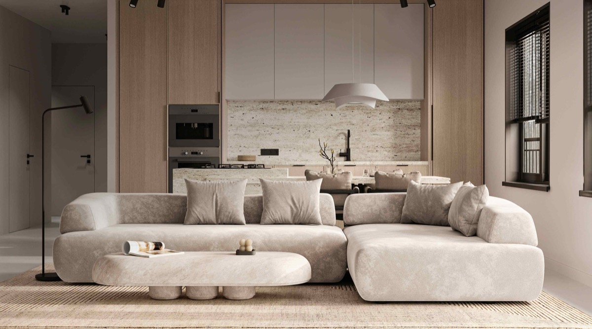
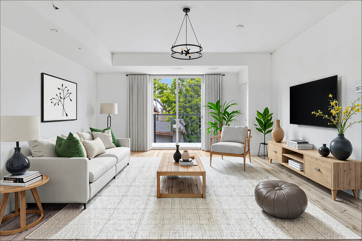
Living Room
As the social hub, the living room benefits from warm neutrals that foster conversation and comfort. Start with greige or warm white walls, add a taupe or oatmeal sofa, and layer with natural wood tables and textured accessories. Include one or two organic accent colors through plants or subtle artwork.
Bedroom
Prioritize calming, cocoon-like warmth with soft whites, mushroom tones, and blush undertones. Use the most luxurious textures here: high-thread-count linens, cashmere throws, velvet pillows, and a plush area rug. Keep the palette light for a restful, airy feeling that promotes better sleep.
Kitchen
Kitchens need bright, clean neutrals that feel hygienic and spacious. White or light gray cabinetry with warm wood or butcher block countertops creates a balanced look. Add visual interest through textured backsplash tiles and mixed metal hardware in complementary finishes like brass and matte black.
Bathroom
Spa-like bathrooms thrive on a tight neutral palette of two to three tones. Combine white fixtures with warm stone tiles, natural wood vanity, and brushed nickel or gold hardware. Fresh white towels and green plants provide the only color accents needed for a serene, hotel-inspired space.
Test Neutral Palettes with AI
Upload a photo of your room and see how different neutral color schemes would transform your space. Use the best virtual staging AI to try warm, cool, and earthy palettes before committing to a single paint swatch.