Color Psychology
in Interior Design
Harness the emotional and psychological power of color to transform your spaces. Using Collov AI, the best virtual staging AI, learn how different hues influence mood, energy, and behavior to create intentional, impactful interiors.
Purposeful Palette
Colors That Transform
The Science of Color Psychology
Color psychology examines how different hues affect human emotion, behavior, and physiological responses. Research spanning neuroscience, marketing, and environmental psychology demonstrates that colors genuinely influence mood, productivity, appetite, and even physical sensations like temperature perception. In interior design, understanding these effects allows you to create spaces that support specific activities and emotional states.
Different wavelengths of light trigger distinct neurological responses. Warm colors (reds, oranges, yellows) stimulate the sympathetic nervous system, increasing heart rate, blood pressure, and alertness. Cool colors (blues, greens, purples) activate the parasympathetic system, promoting relaxation, lowering blood pressure, and reducing anxiety. These aren't subjective preferences - they're measurable physiological reactions that occur across cultures, though cultural associations add additional layers of meaning.
In 2025, neuroscience research continues validating what designers have intuitively known for centuries: color is one of the most powerful tools for shaping environmental experience. By selecting colors intentionally based on room function and desired emotional atmosphere, you can create spaces that actively support well-being, productivity, creativity, or relaxation rather than passively housing activities.
Color Effects by Hue
How different colors influence mood, energy, and behavior
Red
Passion & Energy
Increases heart rate, stimulates appetite, creates urgency. Use in dining rooms, gyms, or accent walls. Avoid in bedrooms or meditation spaces.
Orange
Enthusiasm & Warmth
Encourages social interaction, boosts creativity, promotes optimism. Ideal for living rooms, playrooms, or creative studios.
Yellow
Joy & Optimism
Elevates mood, enhances concentration, stimulates conversation. Perfect for kitchens, home offices, or children's rooms.
Green
Balance & Renewal
Reduces stress, promotes healing, enhances focus. Excellent for bedrooms, bathrooms, or home offices requiring concentration.
Blue
Calm & Productivity
Lowers blood pressure, encourages productivity, promotes tranquility. Best for bedrooms, bathrooms, or professional workspaces.
Purple
Luxury & Creativity
Stimulates imagination, conveys sophistication, inspires spirituality. Works in meditation rooms, creative spaces, or luxurious bedrooms.
Pink
Compassion & Nurturing
Creates calming effect, promotes emotional warmth, reduces aggression. Ideal for nurseries, bedrooms, or self-care spaces.
Brown
Stability & Comfort
Grounds energy, creates security, evokes natural warmth. Perfect for living rooms, libraries, or rustic-themed spaces.
White
Purity & Space
Maximizes light, creates openness, provides clean slate. Essential for small rooms, minimalist designs, or as neutral foundation.
Gray
Sophistication & Balance
Promotes focus, conveys professionalism, provides neutral backdrop. Excellent for modern offices, contemporary living rooms, or transitional spaces.
Black
Power & Drama
Adds depth, creates sophistication, grounds bold colors. Use as accent in modern designs or dramatic feature walls.
Beige/Cream
Warmth & Simplicity
Creates cozy atmosphere, provides versatile foundation, promotes relaxation. Perfect for traditional homes, comfortable bedrooms, or welcoming living areas.
Color Strategies by Room
Optimize each space with psychologically informed color choices
Bedroom
Promote Restful Sleep
Choose cool, muted tones that activate parasympathetic nervous system. Avoid energizing reds or stimulating yellows. Consider darker shades for insomnia sufferers to support melatonin production.
Home Office
Enhance Focus & Productivity
Blue increases productivity and promotes analytical thinking. Green reduces eye strain during long computer sessions. Add yellow accents to boost creativity without overwhelming focus.
Kitchen
Stimulate Appetite & Gathering
Warm colors encourage appetite and social interaction. Yellow promotes cheerful mood during meal prep. Avoid excessive blue (suppresses appetite) unless intentional for dietary goals.
Living Room
Balance Energy & Relaxation
Create versatile space supporting both energetic gathering and peaceful relaxation. Use neutral foundation with adjustable accent colors through pillows, art, and accessories.
Bathroom
Create Spa-Like Serenity
Cool colors evoke water, cleanliness, and tranquility. Add warm wood tones to prevent clinical feel. Consider mood lighting to adjust atmosphere from energizing morning to relaxing evening.
Exercise Space
Motivate Movement & Energy
Use energizing warm colors to boost motivation and physical performance. Balance intensity with neutral foundation to prevent overwhelming stimulation during cooldown.
Thoughtful Color Applications
Spaces demonstrating psychological color principles
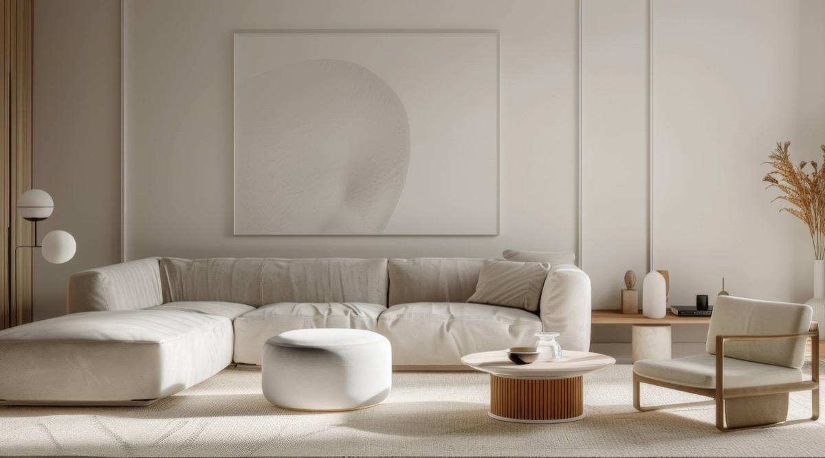
Restful Neutrals
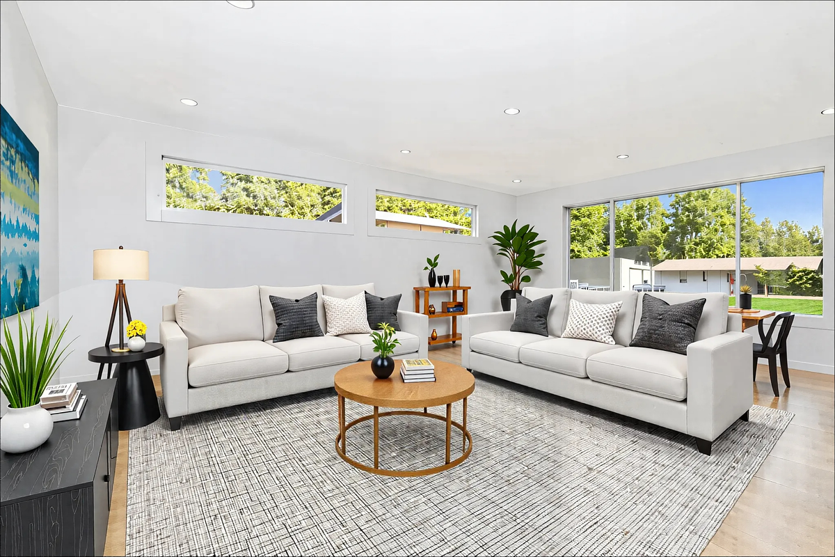
Energizing Brightness
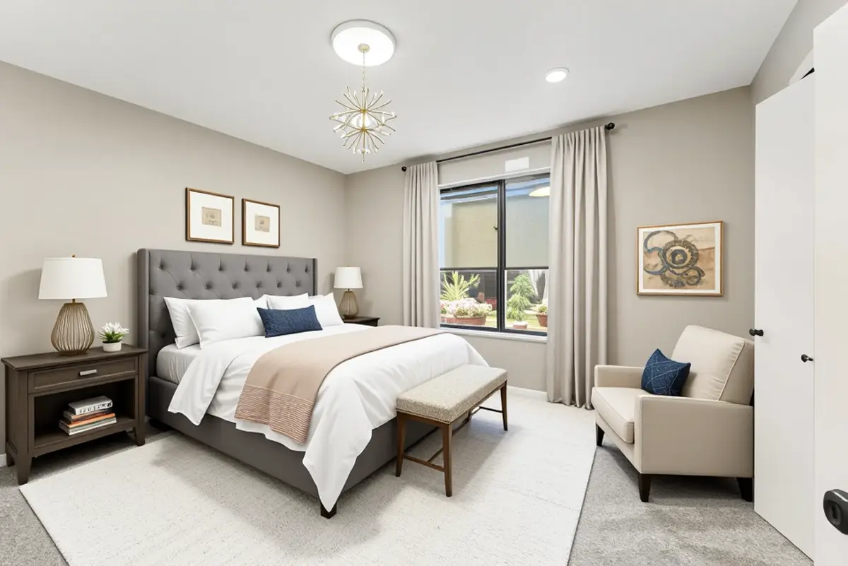
Balanced Grays
Practical Color Applications
Use the 60-30-10 Rule
Professional designers rely on this classic proportion: 60% dominant color (usually walls and large furniture), 30% secondary color (upholstery, curtains, smaller furniture), 10% accent color (pillows, art, accessories). This ratio creates visual harmony while preventing any single color from overwhelming the space. Apply psychological principles by choosing your dominant color based on desired room mood - calming blue for bedrooms, energizing yellow for kitchens.
Consider Natural Light Exposure
A color's psychological impact changes dramatically based on lighting conditions. North-facing rooms receive cool, indirect light that can make blues and grays feel cold; warm them with creamy whites, soft yellows, or warm beiges. South-facing rooms get intense warm light that intensifies warm colors; consider cooling them with sage greens or soft blues. Test paint samples at different times of day before committing to understand how natural light cycles affect perceived color and mood throughout the day.
Adjust Saturation for Intensity
Color psychology isn't just about hue - saturation (intensity) equally impacts emotional response. Highly saturated colors (vivid, pure hues) create energy, excitement, and stimulation but can exhaust over time. Desaturated colors (muted, grayed tones) feel sophisticated, calming, and easier to live with long-term. For restful spaces, choose desaturated versions of any color. For energizing spaces, incorporate pops of saturated color against muted backgrounds.
Create Transitions Between Spaces
Color can guide movement through your home and create psychological preparation for different activities. Use progressively cooler or warmer colors to transition from public to private spaces. Paint hallways in neutral tones that complement but don't compete with adjoining rooms. Consider color flow when visible from one room to another - jarring color shifts create visual and emotional discord, while thoughtful transitions promote harmonious whole-home experience.
Test Before Committing
Never choose wall colors from tiny paint chips alone. Purchase sample pots and paint large swatches (at least 2x2 feet) on multiple walls. Observe them for several days under different lighting conditions - morning sunlight, afternoon shade, evening artificial light, overcast days. Notice your emotional response when entering the room at different times. Colors that seem perfect in store lighting may feel completely different in your specific space with your furniture and natural light patterns.
Balance Personal Preference with Function
While color psychology provides guidelines, your personal associations matter too. If blue reminds you of a beloved childhood bedroom, it may feel more relaxing than research suggests. Conversely, if you have negative associations with certain colors, avoid them regardless of theoretical benefits. The most effective color choices honor both psychological research and your unique emotional responses, creating spaces that feel both scientifically optimized and personally meaningful.
Design with Color Psychology
Use our AI design tools to create color palettes optimized for your goals. Get personalized recommendations based on color psychology principles for spaces that truly support your well-being.